
It has been a while since the last post was published, but here we are, back with great news:
We proudly announce NewPipe version 0.14.0, which comes with a more customizable main page, a better navigation menu and several player improvements.
@Somethingweirdhere invested time to polish NewPipe’s UI. We all thank him for his effort. Due to the new look and the even more customizable main page, we think a short summary of the changes in NewPipe 0.14.0 might be helpful to all users who want to try them out immediately.
Better Navigation Menu
@Somethingweirdhere helped introduce a more Material style look by adding the content from the options menu to the navigation menu. You can open it by clicking on the burger menu icon on the top left or swiping from the left edge of the screen to the right.
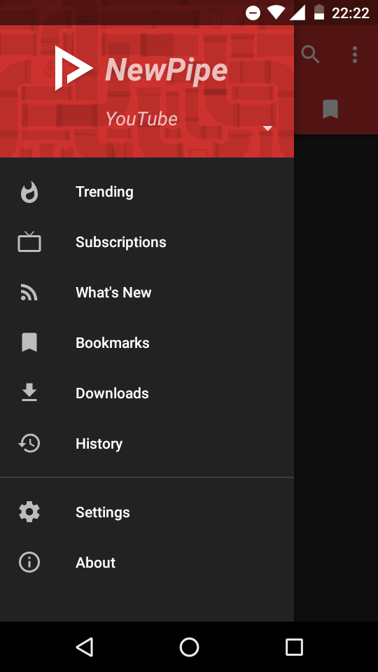
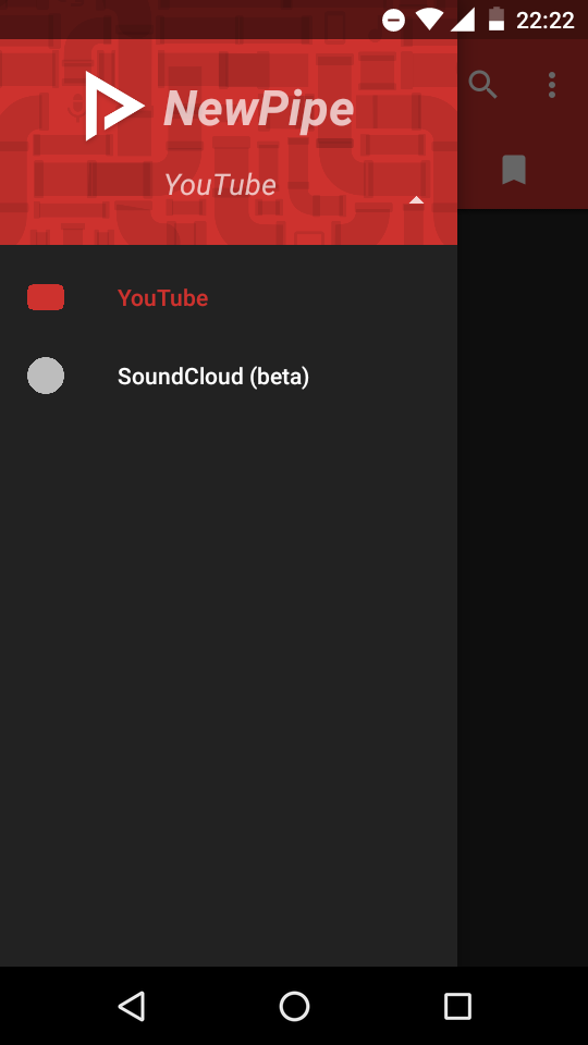
You will notice a new element structure in the navigation menu. As NewPipe aims to support multiple services, only the respective sub-pages are visible and all services are hidden. So-called “kiosks” such as “Trending” in the case of YouTube or SoundCloud’s “Top 50” change here depending on the active service. To change to another service, tap on the small triangle in the lower right corner of the NewPipe banner, which allows you to switch between all available services.
YouTube is used by default. To switch to e.g., SoundCloud instead, tap on it, and you’ll notice a change in the color theme. Furthermore, the navigation menu will contain the “Top 50” and “New and Hot” kiosks instead of the YouTube ones.
More flexibility on the main page
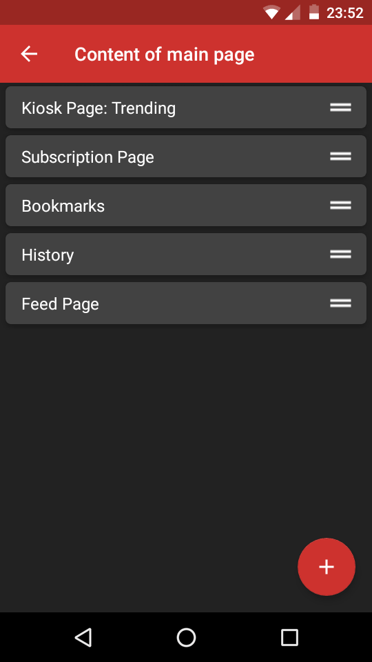
Starting with version 0.14.0 it is now possible to add and remove several tabs to and from your main page. To do so, open the settings via the navigation drawer. In contrary to earlier versions, the content management of the main page is now placed in the category “Appearance”. The specific setting is still called “Content of main page”. Tap on it to manage the different tabs.
You can reorder the tabs via drag and drop and remove a tab by swiping it to left or right side of the screen. To add a new tab, use the “+” button at the right bottom. To make this feature as convenient as possible, changes will be saved automatically, and will survive restarts.
Further changes
As explained in the FAQ, NewPipe does not support downloads to external SD cards by now. To improve the user experience and prevent the app from crashing (yes, it actually did!), users are now warned when selecting a directory on an external SD card.
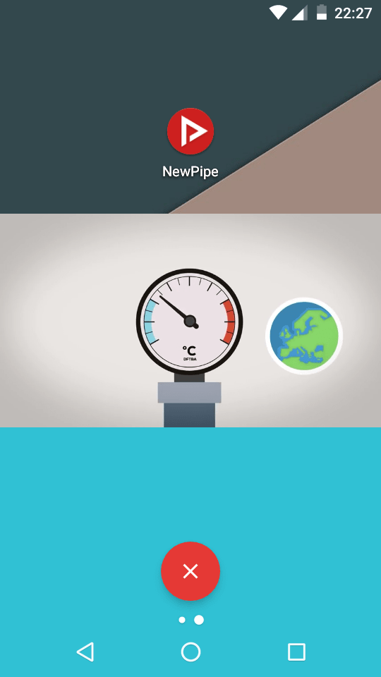
Some users requested a better way to close NewPipe’s popup window. To address this request, @mauriciocolli added a red closing button, which appears on the bottom of the screen when the popup window is moved. To close the popup, just drag it onto the button, just like e.g., app links on the home screen which should be removed.
@TheMatten improved the player’s UI when changing volume and brightness.
As usual, the team fixed a couple of bugs in the new version. For example, in the search results, only the first two pages were loaded and then repeated infinitely. This bug was fixed by @theScrabi.
YouTube Premium videos are blocked correctly now. Some videos which did not load due to issues in the MPEG-DASH parser should now load as expected. A bug which prevented video thumbnails to not show up on the notification on Android 8.1 has also been fixed. Also, more links in the video description work correctly now.
Some incorrect information was corrected. We’ve removed the explanations of M4A and WebM audio formats from all translations. At this point we would like to thank the numerous translators which updated and improved translations for this release.
Get the new version
You can download NewPipe 0.14.0 either from F-Droid or the GitHub release page.
We recommend you to install the F-Droid app as it notifies you as soon as an update for NewPipe is available.
Please let us know about your experience in the latest release, especially bugs that need to be fixed. As usual, you can reach out to us via IRC (#newpipe on Libera.Chat), open issues on GitHub or ideally use our built-in crash reporter to send us machine-readable issue reports.
Let us know what you think!
Please read our rules before leaving a comment!
→ Feature requests or bug reports need to be reported on GitHub! ←
Markdown and HTML support
Line breaks: two get line breaks, you need to make two line breaks in Markdown.
You can use the following options to make your comments stylish:
strikeh4
h5
h6
Lists must have one empty line between every item:
Bullet list:
Ordered list: